W.E.B. Du Bois’s Serpentine Bar Chart
The Paris Exposition Universelle of 1900 featured the first public showing of a motion picture with sound, a pavilion of Rodin’s sculptures and drawings, an electric moving sidewalk, Rudolf Diesel’s prototype engine (which ran on peanut oil), the largest refracting telescope made at the time, and more than 80,000 other exhibits.
American sociologist and statistician William Edward Burghardt Du Bois, then a professor at Atlanta University, was asked to prepare an exhibit on African American life, showing progress made by African Americans in education, literature, industry, and science since the Civil War.
But how could he attract attention to an exhibit featuring statistics, with so many other wonders competing for viewership?
A splendid new book, W. E. B. Du Bois’s Data Portraits: Visualizing Black America, shows how Du Bois drew crowds to his gold-medal-winning exhibit (you can still see the Exposition’s medallion on red-and-white-label cans of Campbell’s soup, which also won a gold medal in 1900). The book reproduces 63 infographics from the Exposition Nègres d'Amerique.
These are not your ordinary bar charts and line graphs. The data displays sparkle with brilliant colors and eye-catching, innovative designs. You can see the full digitized collection of graphs at the Library of Congress website.
The representations include spiral bar charts (Plate 25); a circle graph showing the proportion of black and white workers in different professions (Plate 44); and a ziggurat-shaped graph displaying the relative numbers of single, married, and widowed African American men and women for each age group (Plate 53). Du Bois also presented data on crime (Plate 60) — his book The Philadelphia Negro (1899) had been one of the first scholarly works to investigate crime patterns using data.
My favorite of all the graphs, though, is the serpentine bar chart. Anyone who graphs data has encountered a data set where most of the values are small, but one or two values are much larger (statisticians call these “outliers”). This often presents a challenge for data display. If you show all the numbers on the same scale, the small values may be indistinguishable. If you omit the large values from the graph, the reader does not see the contrast. And “gapped” bar charts, where the longest bar contains a gap to indicate a break in scale, mislead the viewer about the relative magnitudes (here is a particularly horrible example of a gapped bar chart, found within a set of instructions for making these abominations). Some statisticians recommend graphing the logarithms of the data values, but that requires readers to think in logarithmic scale.
Du Bois, in plate 17, found an ingenious solution to the problem. His data consisted of the numbers of African American students enrolled in different educational programs, where the number of students in industrial programs was nearly 200 times as large as the number of students in business programs. He snaked the last bar around so that its straightened length was proportional to the data value, yet the values in the shorter bars in the graph could be distinguished.
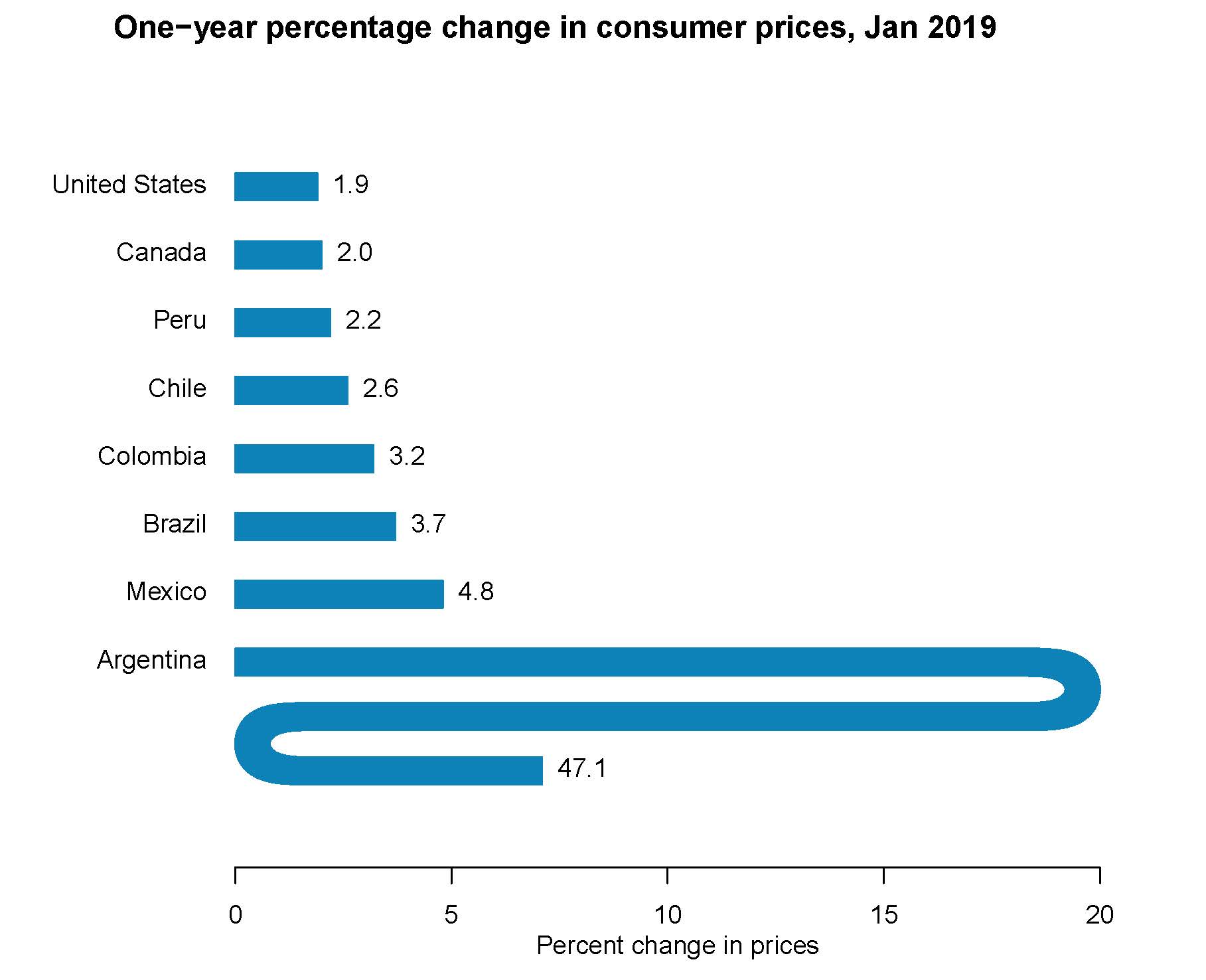
I wrote a program in the R statistical software language to create a serpentine bar chart using data from page 80 of the January 26, 2019 issue of The Economist on the percentage increase in consumer prices over the previous year for 42 countries; the chart below displays the values for countries in the Americas. Argentina’s price increase is much larger than the other values, as can be readily seen from the graph.
Many variations of this graph are possible. Du Bois’s chart, on the left, represents the last data value by the total length of the snaked bar, as would be measured by laying a string on top. My chart, on the right, represents the value by the total horizontal length so that the scale below the graph gives the correct value for Argentina (2 x 20 + 7.1).
W. E. B. Du Bois’s Data Portraits: Visualizing Black America describes how Du Bois and his team created the graphs, building upon earlier data visualization work of William Playfair and Florence Nightingale. The exhibit presented, in Du Bois’s words, “an honest, straightforward exhibit of a small nation of people, picturing their life and development without apology or gloss, and above all made by themselves.” The vibrant graphics drove the message home.
Battle-Baptiste, W. and Rusert, B. (eds, 2018). W. E. B. Du Bois’s Data Portraits: Visualizing Black America. New York: Princeton Architectural Press, 144 pages.
Copyright (c) 2019 Sharon L. Lohr

